The Cellar: a friendly neighborhood coffee shop, with no coffee and no shop. Established 1990.
- xoxoxoBruce
- The Future is Unwritten
 Offline
 - Registered: 10/15/2020
- Posts: 4,355
True Map
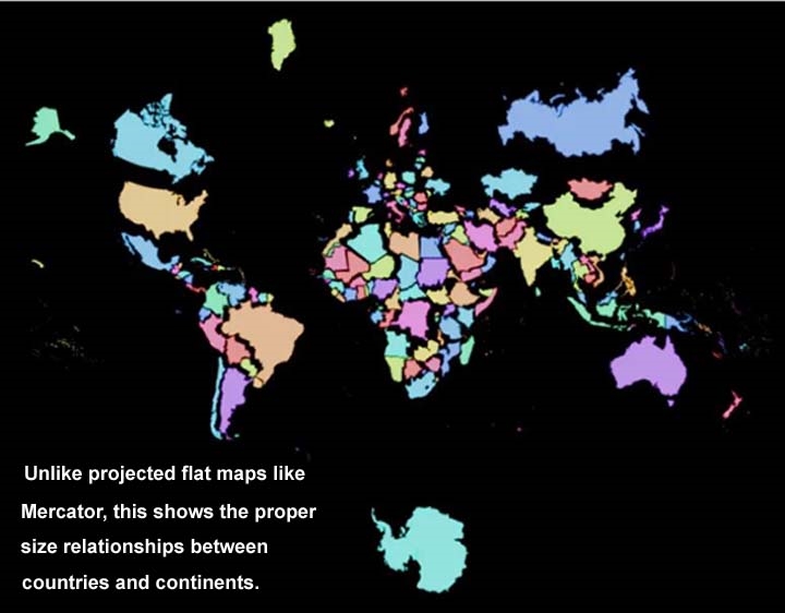
All the attempts to show a 3-D world on a 2-D sheet of paper use various projections, the most common being Mercator.
he result is grossly exaggerated difference in size of continents and countries. This one is more accurate in their relationships.
Freedom is just another word for nothin' left to lose.
- glatt
- TM
 Offline
 - From: Arlington VA
- Registered: 10/13/2020
- Posts: 1,230
Re: True Map
I like that, in an artistic sort of way. But it's fairly useless when looking at a region to see how neighboring countries fit together.
- Diaphone Jim
- Not Ignoring You.
 Offline
 - Registered: 10/13/2020
- Posts: 1,433
Re: True Map
That view needs to be added to the corner of Mercator maps.
- Flint
- starting fires since forever
 Offline
 - From: i am dumb
- Registered: 10/13/2020
- Posts: 1,569
Re: True Map
big, huge Africa, little baby America
signature s c h m i g n a t u r e
 1 of 1